About Sherice Jacob

Sherice Jacob helps business owners and bloggers improve website design and increase conversions through her company at iElectrify.com, which provides a free conversion checklist, web copy tune-up, and professional website reviews to improve conversion rates.

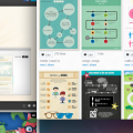
Creating Your Own Infographics (The Graphically-Challenged People’s Guide)

Screen Shot 2013-02-11 at 1.44.21 PM

For the business owner, infographics have wide-ranging appeal and numerous benefits. But how do you actually go about creating one? Some enterprising entrepreneurs have brought the craft of infographic design to the web-–and currently, many of the options available are free while the services are still in beta.

17 Reasons Why Your Target Audience Isn’t Listening to You

http://www.flickr.com/photos/pagedooley/5075209982/

You’ve worked hard on your new launch. You’ve got an unbeatable offer. You’re chomping at the bit to tell the world on Twitter and Facebook. Then when the big day rolls around… You get nothing. Not even a chirp.

Is Groupon Killing Small Businesses?

Be sure to weigh all the pros and cons of seeking out new customers with Groupon. You might get far more (not always in a good way) than you bargained for. Sherice Jacob offers some thoughts to consider before using a social coupon site’s services.

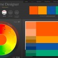
4 Excellent Resources for Choosing Website Color Schemes

colorschemedesigner

Whether you want your site to be perceived as vibrant and energetic, or sophisticated and luxurious, you’ll find the following four resources extremely helpful for choosing a color scheme that sets your website apart from the competition.

4 Unusual Questions to Ask Your Web Designer

1092423656_07f3fa3052_b

Although these questions may not seem to have much in the way of relevance to the project at hand, you’ll be glad you asked them, as the answers can give you an indication of whether or not you’re working with a true professional.

Web Design Zen: The Power of Simplicity

Boost conversions, keep visitors on your site longer, and go for simplicity — and no, simplicity doesn’t mean your site needs to look like a poorly formatted Word document.